Living & Kitchen Renovation, Gymea Bay
Gaining additional space for a new kitchen and living areas required creative thinking and problem solving. Yet without any extending or additions we were able to gain a 75% increase in the homes’ footprint as well as improve access to the park-like yard! This is how…
The Client
My client for this renovation is a busy CEO and mum to three teenagers.
“The house is old and the areas we worked on were tricky,” explains owner, Belinda. “I was anxious about all the different stages, but Richelle briefed all the trades, and the project ran smoothly, on time and it was exciting watching it all come together.”
“With a demanding business and motherhood my free time is valuable, and I loved that I didn’t ever have to go traipsing around on the weekends trying to decide what goes with what. The only outing I did make was shopping together for kitchen appliances and that was enjoyable.”
The Location
A bay-side enclave with a reserve-like yard.
The Brief
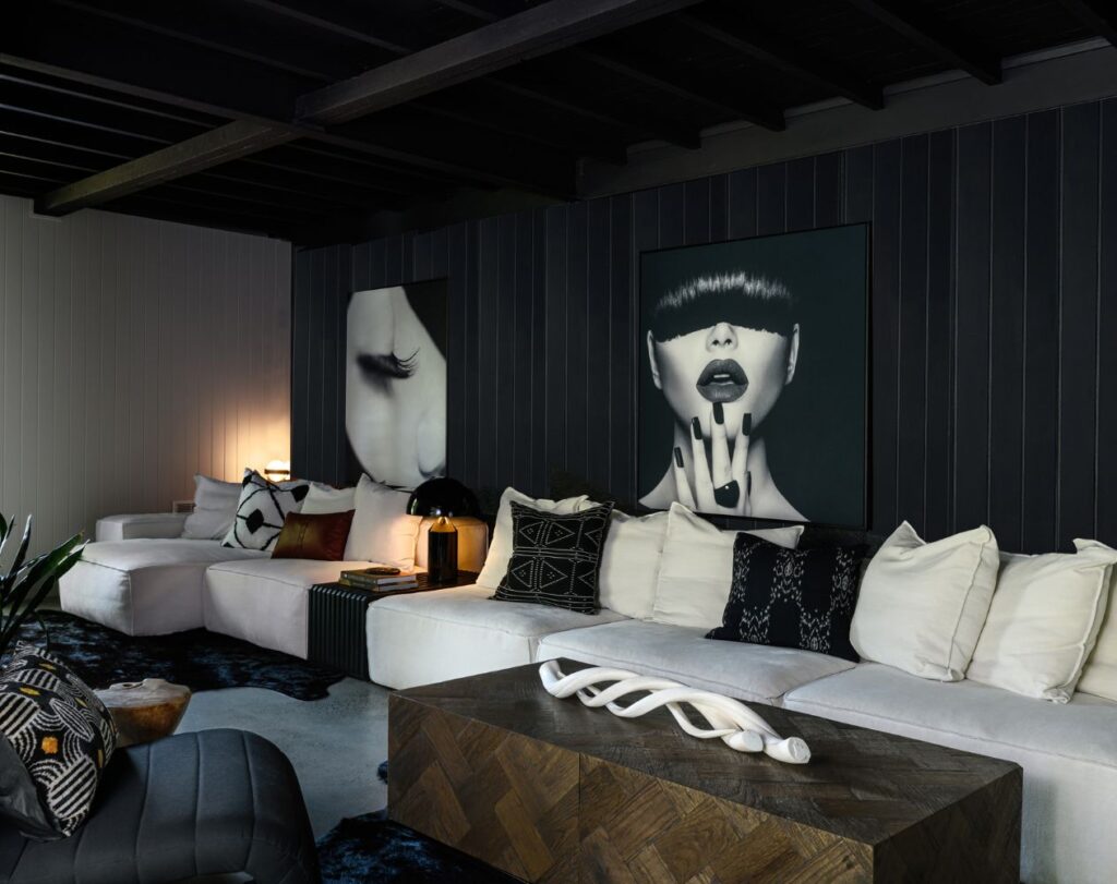
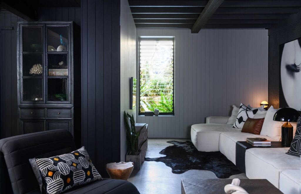
The brief was to explore the potential at lower ground level to accommodate a kitchen, living, and dining area with a shower/laundry room. The spaces are to be edgy and designed with as much black as possible.
Living & Kitchen Renovation
There were several issues to tackle before getting down to designing.
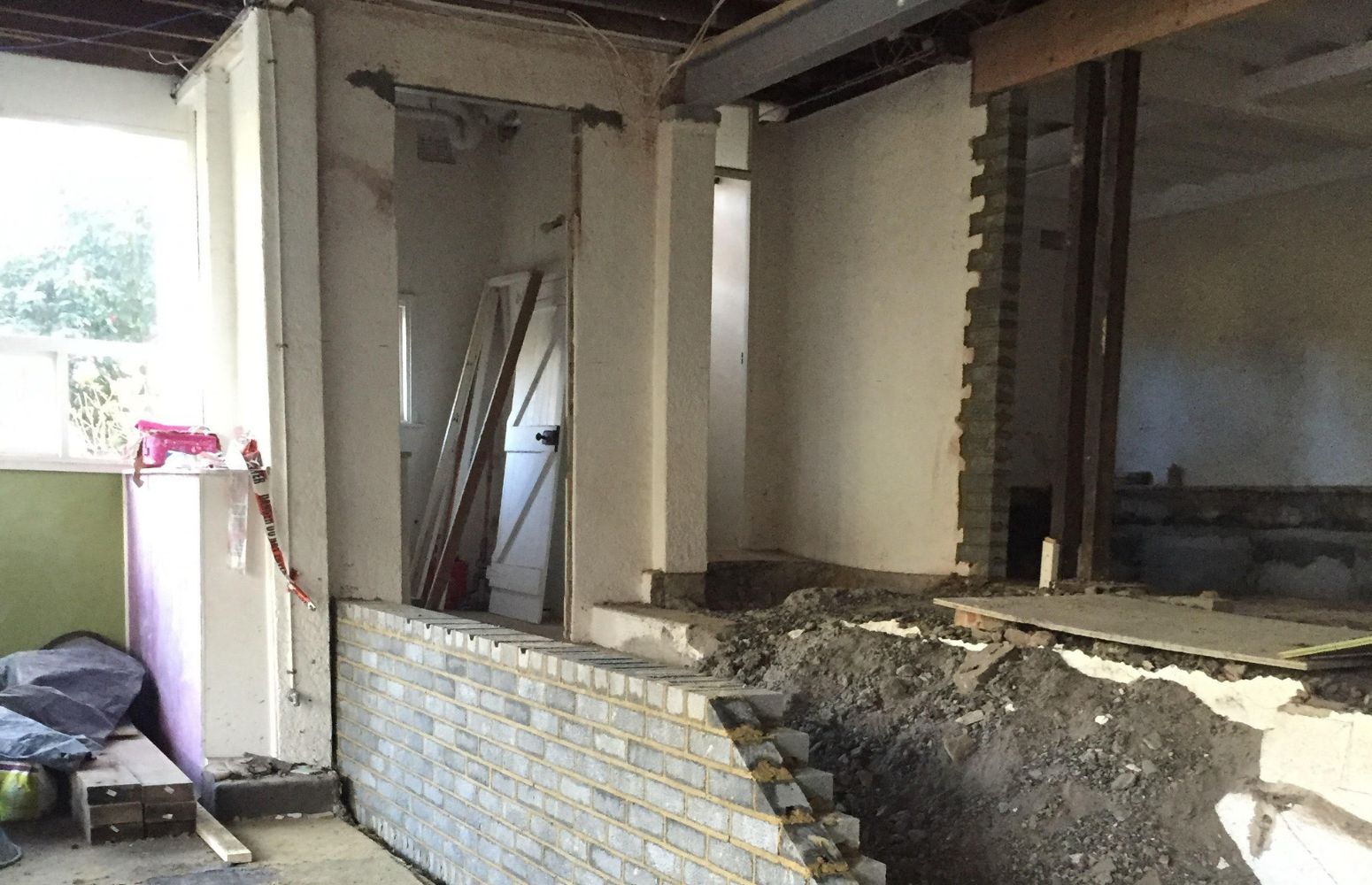
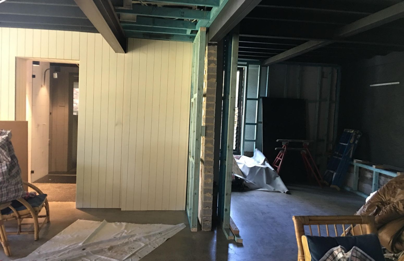
Clearances: Over half the area was excavated approximately 500mm to achieve minimal habitable heights. A concrete slab was required, and we were able to achieve a polished concrete floor in this section.
Access: A steel and spotted gum spine back staircase descends from the front entrance.
Drainage: Large-scale artwork not only injects the clients’ personality into the space, they hide access doors to the drainage pit behind.
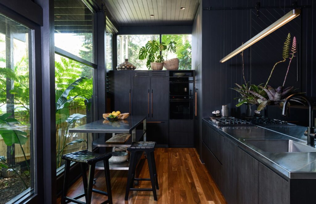
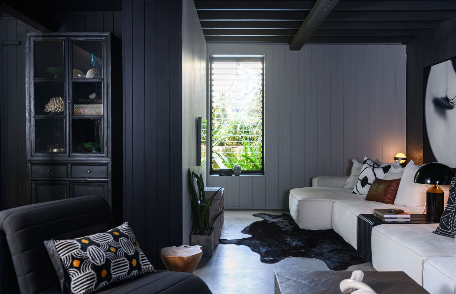
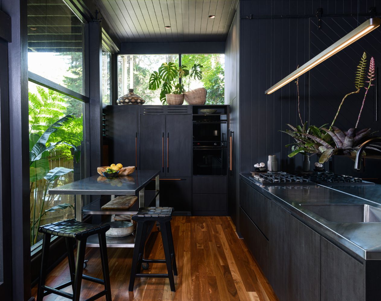
The sloping nature of the site translates into a split-level space, so we opted for a material change. Spotted gum flooring on the kitchen/dining level adds warmth, acoustic properties and a contrast to some of the harder elements.
The kitchen, while narrow, is well equipped and the commercial-style trolley acts as an island that can be moved out to accommodate more seats when required. Oversized floor-to-ceiling windows look out to a reserve-like yard.
The Look
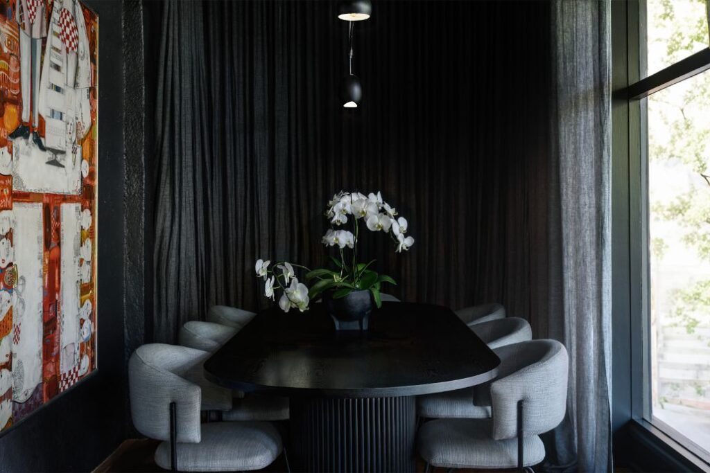
With an exclusive club-like feel this space packs loads of personality… It’s a vibe!
The Testimonial
“My experience with Richelle was completely collaborative,” says owner Belinda. “She really listened, she took my aesthetic, refined it and executed it in a way I couldn’t have imagined. I loved the process and these spaces Richelle created feel exactly like me. Our home is unique and that’s what we love. My kids’ friends think it’s cool and it’s become the perfect place to gather for my older teenagers”.
Keen to make the most out of your home renovation? Get in touch with me today.
Before & Afters
Photography: © Owen Hall

